In the world of digital and print design, fonts are more than mere text carriers – they are the voice of your brand, whispering stories of sophistication, playfulness, or bold innovation.
At Creative Digital, we often turn to independent type foundries for that spark of originality that sets our clients’ projects apart from the mainstream. These foundries craft high-quality, bespoke typefaces that demand a premium investment – but the payoff is a distinctive identity that resonates long after the first glance.
Whether you’re refreshing a website’s hero section, crafting a print brochure, or launching a new brand, unique fonts can transform ordinary layouts into memorable experiences. Below, we spotlight eight standout foundries, each with inspirational examples to fuel your next project. These aren’t your everyday Google Fonts; they’re artisanal creations designed for discerning clients who value exclusivity.
Tropical Type: Sunny Scripts for Nostalgic Escapes
From the sun-soaked shores of Byron Bay, Australia, Tropical Type channels a nomadic spirit into vibrant, character-driven display fonts that capture the essence of carefree creativity. Founded in 2016 by designer Tom Cunningham, this boutique foundry specialises in “fast fonts” – single-weight wonders that blend simplicity with playful details, perfect for solopreneurs and small teams seeking instant tropical flair.
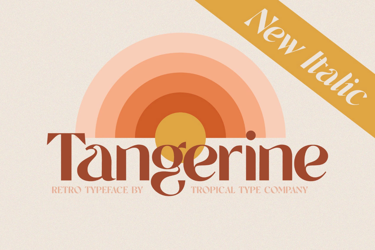
Their TT Tangerine script, with its swirling vintage curves and multilingual alternates, has rocketed to global fame, gracing luxury packaging, designer logos, and even campaigns for the planet’s biggest performing artists. For a web-based wellness retreat site, let it dance across booking forms and testimonials, evoking lazy hammock afternoons that boost conversion with sheer delight. In print, it transforms event flyers into irresistible invitations, like a beach wedding suite that whispers adventure. Though entry-level pricing hovers at a modest $NZD 25 per style – with bundles climbing to $NZD 250 for comprehensive access – this reflects the foundry’s commitment to accessible artistry that punches well above its weight in exclusivity and joy.
Visit https://tropicaltype.com/
Grilli Type: Precision with a Narrative Twist
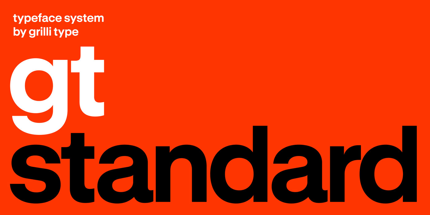
Based in Switzerland, Grilli Type excels in story-driven sans serifs that blend technical precision with emotional depth. Their collaborative ethos shines through in retail and custom work, making them ideal for brands seeking a timeless yet fresh aesthetic.
Take Pinterest’s rebrand, where Grilli Type’s custom Pinterest Sans unifies the platform’s visual language across web and app interfaces. This typeface’s warm, approachable curves could inspire a lifestyle blog’s navigation menu, ensuring effortless readability while injecting personality into headers. For print, imagine it on a coffee table book cover – subtle yet commanding. At the high end of pricing, it’s an investment in versatility that pays dividends in user engagement.
Visit: https://www.grillitype.com
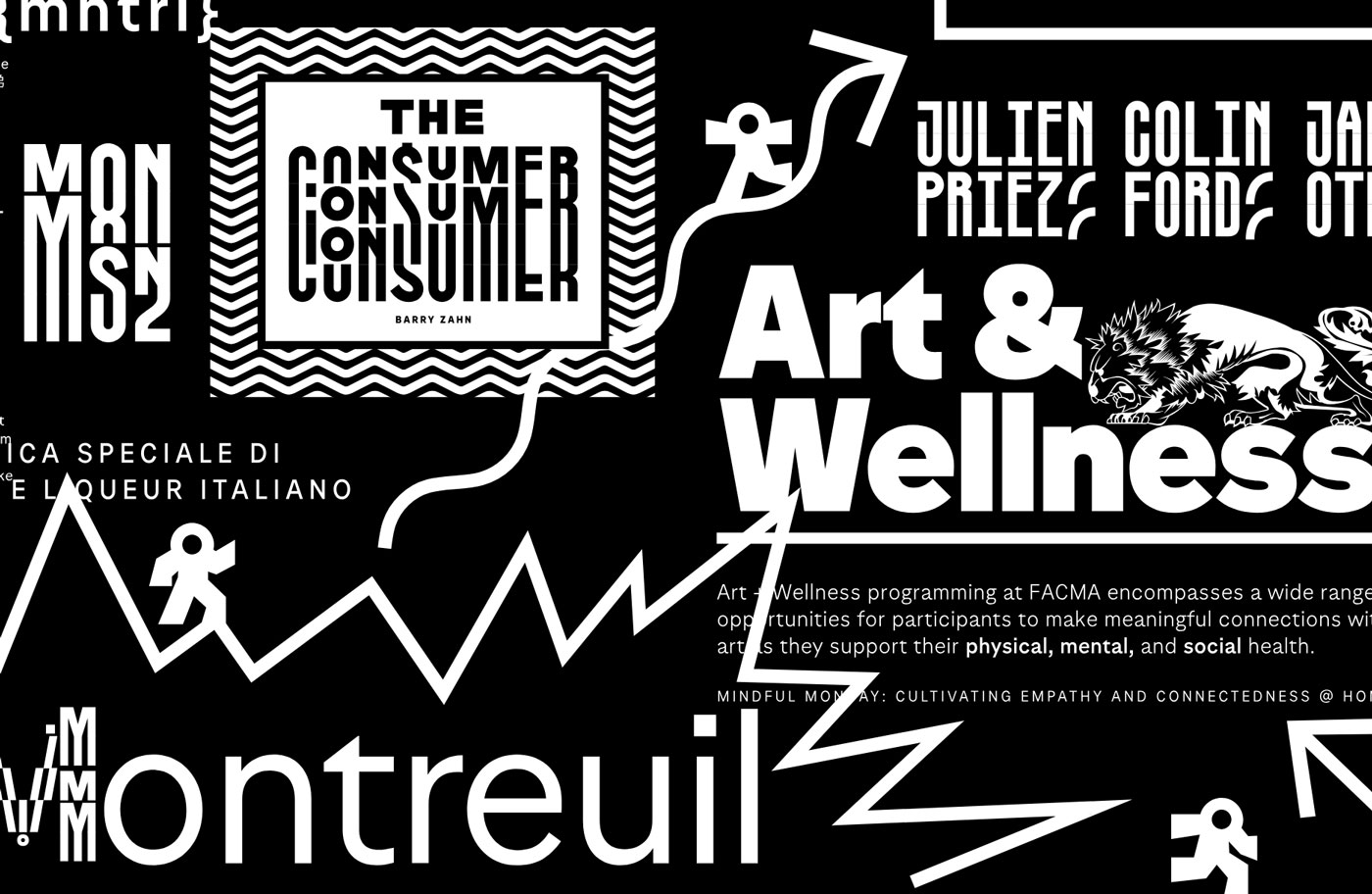
OH no Type Co: Quirky Displays for Expressive Storytelling
OH no Type Co brings a thrill of experimentation to display fonts, merging mainstream appeal with offbeat charm. Perfect for projects that need to stand out without shouting.
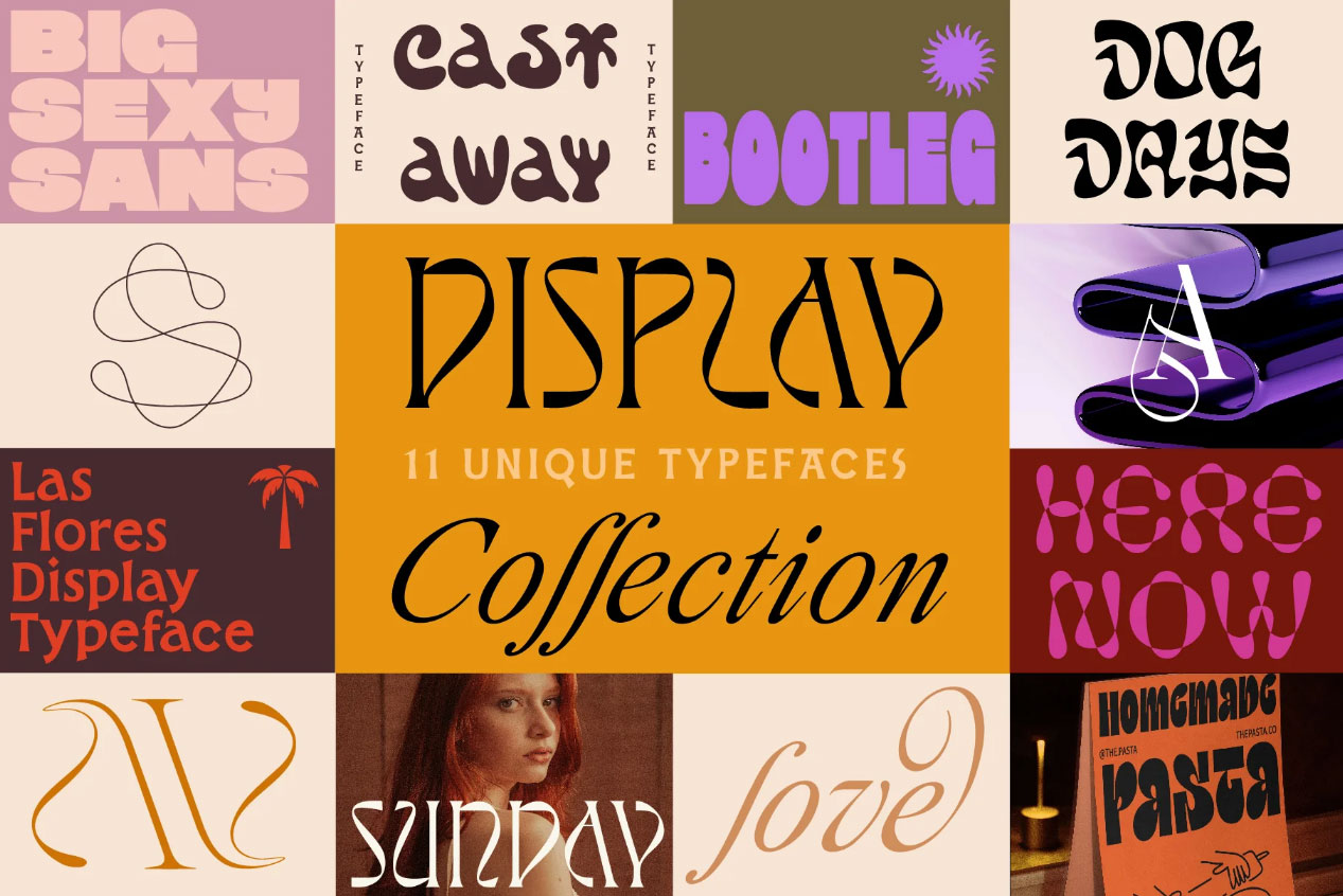
Their Casserole font, an ornate nod to family recipes and nostalgia, powers intimate food blogs and menu designs with its handcrafted flourishes. Picture adapting this for a web-based recipe series: animated letterforms that “cook” on scroll, drawing visitors deeper into the content. In print, it elevates invitation suites for events, turning paper into a tactile narrative. The premium cost reflects the foundry’s dedication to joyful, one-of-a-kind details that foster emotional connections.
Visit: https://www.ohnotype.co
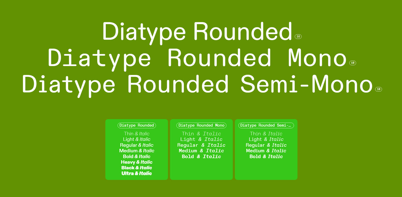
Dinamo: Bold Systems for Global Reach
From Berlin, Dinamo crafts research-backed typefaces with multiscript support, prioritising ethical design and visual impact. Their work suits ambitious brands with international ambitions.
Dinamo’s own website is a masterclass in typographic hierarchy, earning accolades for its clean, modular layout that showcases fonts in dynamic contexts. Use this as a blueprint for a corporate site’s landing page: layered sans serifs that guide the eye through services, adaptable for multilingual e-commerce. For print campaigns, their bold weights command attention in annual reports or posters. This high-end choice ensures scalability without compromising on cultural nuance.
Visit: https://abcdinamo.com
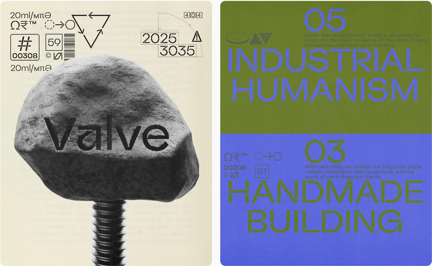
Pangram Pangram: Contemporary Variables for Modern Brands
Pangram Pangram specialises in charismatic variable fonts that nod to graphic design’s cutting edge, offering fluid adjustments for responsive web needs.
Their revamped site features a “Fonts in Use” gallery, highlighting real-world applications like editorial layouts and branding kits that pulse with geometric elegance. Draw from this for a portfolio website: variable weights that shift with viewport size, creating immersive hero images. In print, it shines in zines or packaging, where subtle variations add depth. The elevated pricing underscores the foundry’s focus on forward-thinking tools that future-proof your designs.
Visit: https://www.pangrampangram.com
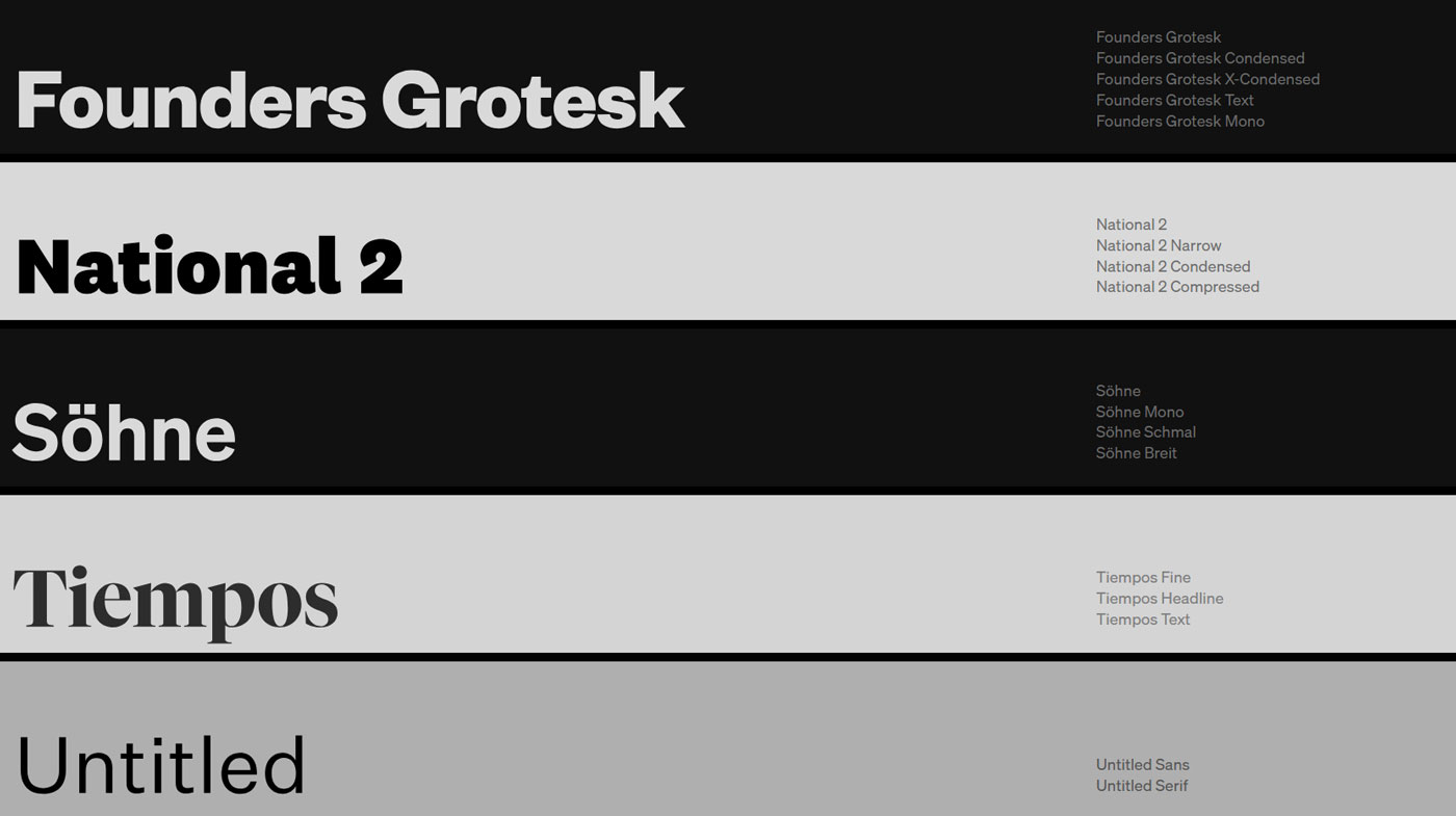
Klim Type Foundry: Historical Roots, Contemporary Craft
Hailing from Wellington, New Zealand, Klim draws on archival influences to forge fonts for giants like Apple and National Geographic. Their ethos? “A thing well made.”
Klim’s redesigned website, a Webby winner, centres the user with intuitive browsing and contextual previews, inspiring seamless e-learning platforms or gallery sites. Envision American Grotesk – a Franklin Gothic revival – powering a news site’s typography, with robust serifs for print editions that echo digital elegance. This premium tier reflects the craftsmanship that turns fonts into enduring assets.
Visit: https://klim.co.nz
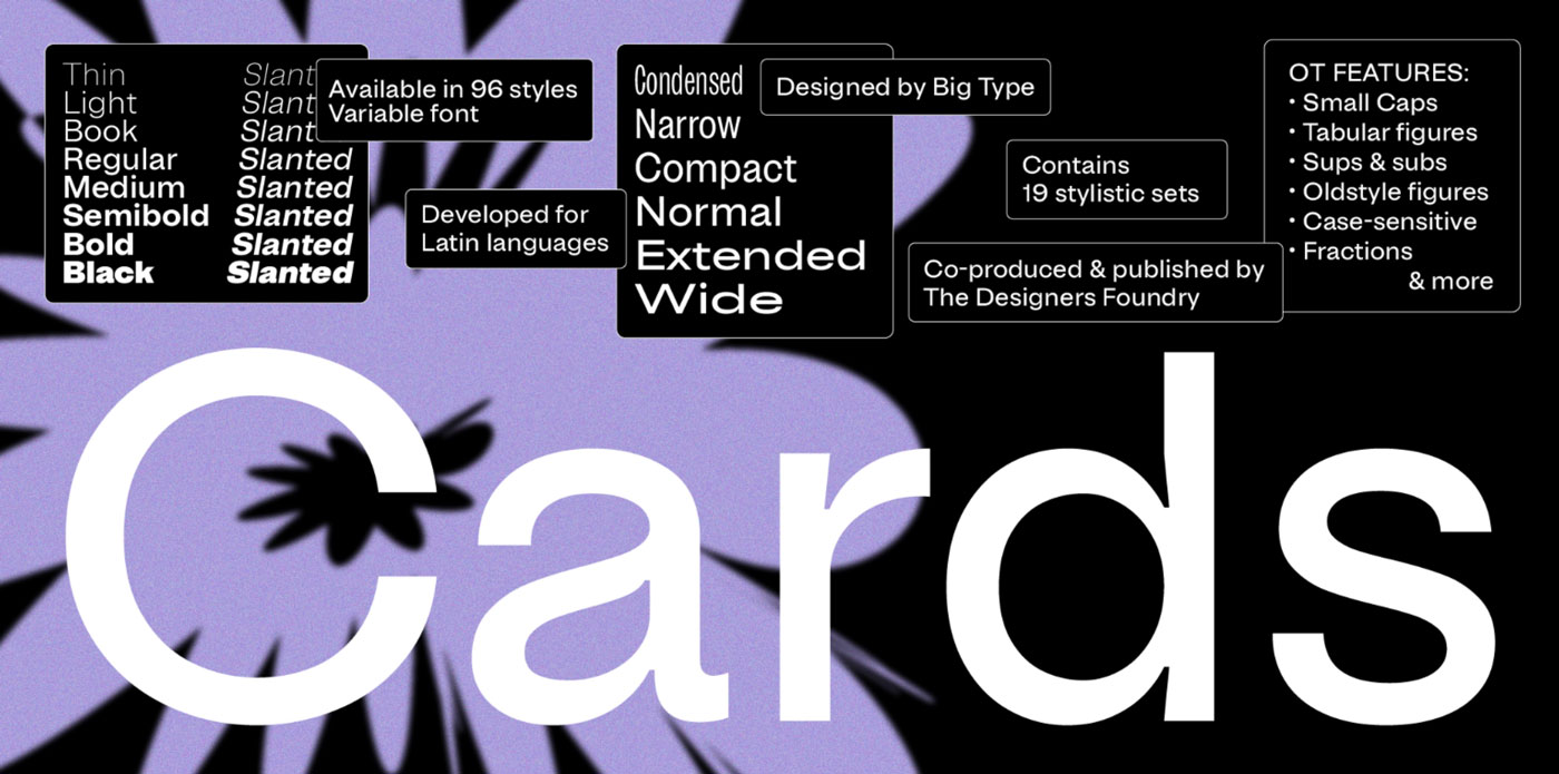
The Designers Foundry: Functional Elegance for Global Icons
Nestled in Canterbury, New Zealand, The Designers Foundry was born in 2012 as a side hustle by designer Daniel McQueen, evolving into a powerhouse team crafting retail and custom typefaces that marry utility with understated flair. With a philosophy rooted in accessibility and innovation, they deliver modern fonts that serve high-stakes environments – from digital interfaces to print ephemera – for an elite roster of clients including Apple, BBC, Disney, Nike, Netflix, MTV, Virgin, and Hugo Boss.
Their Bisel variable display typeface, a bold mechanical sans with a width axis inspired by mid-century masters like Herb Lubalin, packs 16 styles plus extensive OpenType features for dynamic expression. This powerhouse could supercharge a fitness app’s motivational banners, condensing dramatically for mobile hero text that packs a punch on scroll. In print, envision it etching luxury sportswear catalogues, where adjustable widths create rhythmic layouts that echo Nike’s high-energy campaigns. At the premium end – starting around $NZD 230 for a desktop license per style, scaling with users and embedding rights – it’s a savvy outlay for fonts that scale effortlessly across global brands, blending reliability with that elusive Kiwi edge.
Visit: https://thedesignersfoundry.com
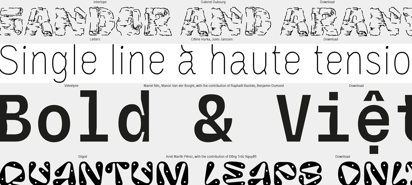
Velvetyne: Experimental Open-Source for Boundary-Pushers
Velvetyne, a French collective, champions open-source experimentation through workshop-born fonts that challenge conventions.
Their site serves as a hub for free yet modifiable typefaces, fuelling creative communities with wild, geometric explorations featured in design roundups. For a web animation studio’s landing page, layer their distorted serifs for parallax effects that mesmerise. In print, they transform posters into interactive art pieces via variable cuts. While some offerings are accessible, custom extensions command high-end fees for truly bespoke uniqueness.
Visit: https://velvetyne.fr
Unique fonts from these foundries aren’t just additions – they’re the soul of your project, justifying every dollar in $NZD through unmatched quality and impact. At Creative Digital, we partner with clients to integrate these gems into web builds, print collateral, and full brand overhauls. Ready to infuse your next venture with typographic magic? Drop us a line today, and let’s craft something extraordinary together.
